Business Intelligence Tools: Introduction to Power BI and Tableau

If you look at how modern businesses make decisions today, one thing becomes crystal clear: data is at the center of absolutely everything. But here’s the catch—raw data sitting in spreadsheets can’t help anyone by itself. What truly matters is your ability to transform that data into insights, visuals, and actionable decisions that people can actually understand and use. That’s exactly where Business Intelligence (BI) tools like Power BI and Tableau come in.
Whether you’re a beginner just stepping into the analytics world or an experienced professional looking to sharpen your skills, understanding these two BI tools opens doors to better reporting, smarter dashboards, and way more impactful decision-making.
Let me break everything down in a simple, conversational way so you understand not just what these tools are, but how they work in real-world analysis and why they matter so much.
What Are Business Intelligence (BI) Tools?
BI tools help you analyze, visualize, and present data in formats that are actually easy to understand. Instead of forcing people to read through endless spreadsheets, you can:
- Build interactive dashboards
- Create compelling charts and visuals
- Track important KPIs at a glance
- Analyze trends over time
- Share insights with your entire team instantly
The beauty of BI tools is that they make data accessible to everyone—not just the technical folks who know SQL or Python.
Introduction to Power BI
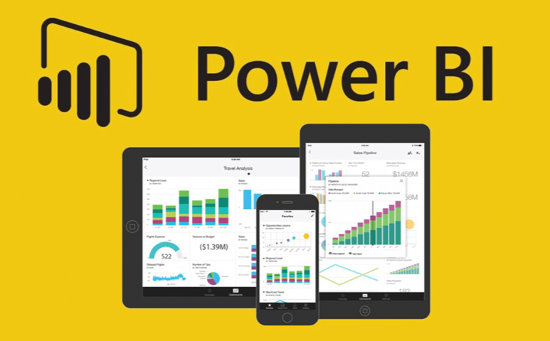
Power BI is Microsoft’s powerful Business Intelligence platform designed specifically for data visualization and reporting. If you’ve ever worked with Excel before, you’ll feel right at home here because Power BI integrates seamlessly with the entire Microsoft ecosystem.
Key Features of Power BI
1. Data Connectivity
Power BI connects with practically everything:
- Excel spreadsheets
- SQL Server databases
- SharePoint
- Azure services
- Web data sources
- APIs from various platforms
This flexibility means you can pull data from wherever it lives without jumping through hoops.
Related Read: Excel for Data Analysis (Essential skills for beginners)
2. Power Query for Data Cleaning
This is where Power BI really shines for practical work. You can:
- Remove duplicates automatically
- Transform data types
- Merge tables from different sources
- Filter out irrelevant records
And here’s the best part—you do all of this without writing a single line of code.
3. Data Modeling with DAX
DAX (Data Analysis Expressions) is like Excel formulas, but way more powerful and flexible.
Example:
Total Sales = SUM(Sales[Amount])
Profit Percent = DIVIDE(Sales[Profit], Sales[Amount])
Once you get comfortable with DAX, you can create incredibly sophisticated calculations.
4. Interactive Dashboards
You can create professional dashboards with:
- Bar and column charts
- Slicers for filtering
- Line charts for trends
- Geographic maps
- KPI visuals that show at-a-glance metrics
The real magic is that users can drill down and filter these charts in real time, exploring the data themselves.
5. Publishing & Sharing
Once you’ve built something great, you can share dashboards via:
- Power BI Service (cloud-based)
- Power BI Mobile app
- Microsoft Teams
- SharePoint
This makes collaboration incredibly easy.
Related Read: Data Cleaning Basics: Techniques Every Analyst Must Know
Real-World Example: Retail Sales Dashboard in Power BI
Let me show you how this works in practice. Imagine you’re analyzing sales data for 50 stores spread across India. Using Power BI, here’s your workflow:
- Import your data from Excel or SQL databases
- Clean it up using Power Query (remove duplicates, fix formatting issues)
- Build relationships between your Products, Stores, and Sales tables
- Create DAX measures for key metrics
- Build visuals that show:
- Top-selling products by region
- Revenue breakdown by store
- Month-on-month growth trends
- Publish the dashboard so management can access it anytime
The amazing thing? This entire workflow can be done by someone with just basic Excel knowledge. You don’t need to be a data scientist.
Introduction to Tableau

Tableau is another leading BI tool that’s famous for its powerful visuals and incredibly intuitive drag-and-drop interface. It’s widely used in analytics teams that need quick insights and advanced visualization capabilities without a steep learning curve.
Key Features of Tableau
1. Drag-and-Drop Analysis
Building charts in Tableau is ridiculously simple. You just drag:
- Dimensions (like Region, Category, Product Name)
- Measures (like Sales, Profit, Quantity)
And Tableau automatically creates smart visualizations based on what you’ve selected.
2. Strong Data Visualization Engine
Tableau is genuinely known for producing stunning visuals:
- Heatmaps that show patterns at a glance
- Scatter plots for correlation analysis
- Tree maps for hierarchical data
- Geographical maps with custom styling
- Advanced, multi-layered dashboards
If visual storytelling matters to you, Tableau is hard to beat.
Related Read: Data visualization Fundamentals: How to Present Data Effectively
3. Works with Big Data
Tableau connects seamlessly to enterprise-level data sources:
- Hadoop clusters
- Snowflake data warehouses
- Google BigQuery
- AWS services
- And tons of other cloud platforms
4. Tableau Prep for Data Cleaning
This is Tableau’s visual interface specifically for data preparation. You can profile, clean, and merge data without touching any code.
5. Sharing Dashboards
You can share your work via:
- Tableau Server (for on-premise deployment)
- Tableau Online (cloud-based)
- Tableau Public (free, but your data is public)
Real-World Example: E-commerce Performance Dashboard in Tableau
Let’s say you’re working for an online marketplace. Here’s how you’d use Tableau:
- Import website analytics combined with sales data
- Create a cohort analysis dashboard to track customer behavior over time
- Use heatmaps to quickly identify which product categories are crushing it
- Build region-based maps to visualize where your customers are concentrated
- Share interactive dashboards with your marketing teams so they can explore the data themselves
Tableau helps teams identify trends quickly and take action based on what they discover.
Power BI vs Tableau: A Practical Comparison
Here’s a straightforward table to help you understand the key differences:
| Feature | Power BI | Tableau |
|---|---|---|
| Ease of Use | Easier for beginners (Excel-like) | Very intuitive visual experience |
| Cost | More affordable | Higher pricing |
| Best For | Enterprise reporting | Deep data visualization |
| Data Modeling | Strong with DAX | Moderate capabilities |
| Speed | Efficient for small-medium datasets | Great for massive datasets |
| Sharing | Power BI Service | Tableau Server/Online |
Which Tool Should You Learn First?
This really depends on your specific goals and situation:
Choose Power BI if:
- You work in a Microsoft-heavy environment
- You prefer Excel-like formulas and workflows
- You want easy deployment and automation
- Cost is a significant factor
- You need tight integration with other Microsoft products
Choose Tableau if:
- You focus heavily on visual storytelling
- You want deeper customization options
- You regularly work with very large datasets
- You’re in a data-intensive industry (finance, analytics, consulting)
- Visual impact is your top priority
If you’re asking for my honest advice: learn both eventually, but start with Power BI. Why? Because it’s easier to pick up, there’s way more job demand for it right now, and it integrates with tools you probably already use daily. Once you’re comfortable with Power BI, picking up Tableau becomes much easier because you already understand BI concepts.
Related Read: Excel for Data Analysis (Advanced Excel Skills)
Real-World Use Cases of BI Tools
1. Business Performance Monitoring
Track monthly sales, expenses, and critical KPIs all in one dashboard that updates automatically.
2. Marketing Analytics
Monitor campaign performance, website traffic, ROI, and conversion rates to see what’s actually working.
3. Operations & Supply Chain
Analyze stock levels, delivery timelines, and vendor performance to optimize your entire supply chain.
4. Finance Reporting
Forecast revenue, track budgets against actuals, and manage cash flow with real-time visibility.
5. HR Analytics
Monitor employee performance, attendance trends, training impact, and retention rates to make better people decisions.
Conclusion
Power BI and Tableau have genuinely transformed the way businesses understand and use their data. Whether you’re building dashboards for your team or analyzing complex trends for senior management, these tools help you move from raw numbers sitting in databases to meaningful insights that drive real decisions.
Learning these tools will give you a massive advantage in today’s data-driven business world. Companies everywhere are desperate for people who can take data and turn it into something useful that non-technical stakeholders can actually understand and act on.
Both tools are incredibly powerful and widely used across industries. What really matters isn’t obsessing over which one is “better”—it’s choosing the right one based on your specific goals and then steadily building your skills through hands-on, real-world projects. Start with one, get comfortable, then expand your toolkit. That’s how you become invaluable in the world of business intelligence.
The data is already there. These tools just help you tell its story in ways that actually matter to your business. So pick one, dive in, and start building. Your future self—and your career prospects—will thank you for it.

Leave a Reply